Here is the link.
 |
| This pic and the 2 others below are sourced from http://www.gampermartino.com/projects/a-100-chairs-in-a-100-days/ |
I thought the project was great and really good inspiration for when the time comes for me to cut up my chair. My favourite piece was the 'hands on' chair.
Each chair feels like a record of a certain mood or style. The structures go from ridiculous and out there to quite restrained and simple. I think the ones that work the best are the more simple structures. The ones that appear quite normal or everyday, but, as you look closer, have something a little unexpected about them.
This one, called Jules with Friend, was interesting because you see it both as two seperate pieces and one functional object. Plus, I like the way in which Gamper chose his chairs . For instance there are some which are universally recognisable eg. a plastic garden chair or those school chairs made of plastic with steel legs. These ones are effective when altered because they are taken out of their usual context and (as it says on the website) their 'status' or 'function' has been changed.
I also had a read of the book 'modernism: designing a new world'. That sounds really fancy, but it's actually a V&A catalogue of the exhibition that was on there a few years ago. There's a great chapter in it called 'sitting on air' which I found really helpful in my research. It describes the changes that took place in furniture design in the years between the end of WW1 and the beginning of WW2. It includes alot of the Bauhaus artists and designers, whose work I think is amazing.
Marcel Breuer, an architect and furniture designer believed furniture could be developed through abstraction, changes in materials and by diminishing the structure of the pieces themselves. I found the merging of these two areas (architecture and furniture) really interesting. I had come across architects designing the interiors and furniture in their buildings for example from the work of Mackintosh or Le Corbusier, but I didn't realise that it was such a common trend. But according to the book ' virtually every architect of note .... felt compelled to turn their attention to the design of at least one chair.'
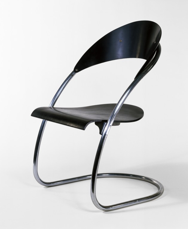
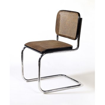
The work of Marcel Breuer, Mies Van der Rohe, Hans Luckhardt and Alvar Aalto stood out most to me.
 |
| Chair designed by Hans Luckhardt in 1929-1930 Source: http://media.vam.ac.uk/media/thira/collection_images/2006AU/2006AU9590.jpg |
 |
Chair designed by Marcel Breuer, 1928 |
I want to try and emulate this cantilever style when we have to chop up our chairs on monday. Obviously this wouldn't work on my wooden chair because wood cant take the same pressure as metal because it doesn't have as much tensile strength. But these designs by Alvar Aalto and Breuer gave me some ideas of how I could go about it.
 |
Alvar Aalto Paimio armchair, 1930 |
 |
| Marcel Breuer, 'Short Chair', 1936 Source: http://www.vam.ac.uk/vastatic/microsites/1331_modernism/files/93/1935_london_breuer.jpg |
I think this wooden versions of the cantilever chairs are just as successful as the metal ones. I like that there's a bit more softness to them- I can imagine them in a home more than the steel versions which look like they should be in a plush office or bar. The Breuer one is really satisfying to look at. It's fluid and all of its componant pieces slot together to give it a sense of harmony and completeness. I'm not expecting to be able to make something like this in a 3 day long project, but I do think there's alot of curved pieces to my chair which I could use as a basis to change it's overall structure.
Finally here are some of my sketches. (I'm aware I'm in need of a scanner)
Still don't understand why they rotate themselves.


No comments:
Post a Comment