Tuesday, 23 November 2010

Goodbye to the chair


So here is the first project in 3D. Last Monday we had to take the furniture we had bought/ found during reading week and dismantle it. It took me ages to break up my chair (I had to prize out about 300 rustly metal tacks with pliers) But it was really satisfying in the end to see all of the pieces I could work with. 


On Tuesday I started experimenting with the pieces and thought about what final piece I would be left with. I found it quite hard to decide on what the chair would be transformed into- I had so many pieces to work with and I wanted to get the best out of them. The main 2 ideas which occured to me were a theatrical headress and a chandelier. After playing about with the pieces a bit I chose the chandelier route.

These photos show my beginning experiments


possible candelabra

chandelier?


went a bit off track and was thinking of birdcages


Second day experiments


Finished frame


Finished light


Thursday, 11 November 2010

Bit of Chair Research

For our 'Reuse, Remake, Reinvent' chair project we were asked to do some research. The tutors suggest we take a look at Martino Gamper's project '100 chairs in 100 days'.

Here is the link.

This pic and the 2 others below are sourced from http://www.gampermartino.com/projects/a-100-chairs-in-a-100-days/

I thought the project was great and really good inspiration for when the time comes for me to cut up my chair. My favourite piece was the 'hands on' chair.


I thought Gamper was clever in the way he added quirky, unexpected touches to his pieces to prevent the stream of chair transformations from becoming repetative or boring. The description by Gamper of the project being like a ' three dimensional sketchbook' was something that really appealed to me. I often collect little bits and pieces like tickets, leaflets, post cards or newspaper articles because at the time I think they'll be useful in a future piece of work, but Gamper's collection of chairs pushed that collecting compulsion to a new level.
Each chair feels like a record of a certain mood or style. The structures go from ridiculous and out there to quite restrained and simple. I think the ones that work the best are the more simple structures. The ones that appear quite normal or everyday, but, as you look closer, have something a little unexpected about them.


This one, called Jules with Friend, was interesting because you see it both as two seperate pieces and one functional object. Plus, I like the way in which Gamper chose his chairs . For instance there are some which are universally recognisable eg. a plastic garden chair or those school chairs made of plastic with steel legs. These ones are effective when altered because they are taken out of their usual context and (as it says on the website)  their 'status' or 'function' has been changed.

I also had a read of the book 'modernism: designing a new world'. That sounds really fancy, but it's actually a V&A catalogue of the exhibition that was on there a few years ago. There's a great chapter in it called 'sitting on air' which I found really helpful in my research. It describes the changes that took place in furniture design in the years between the end of WW1 and the beginning of WW2. It includes alot of the Bauhaus artists and designers, whose work I think is amazing.

Marcel Breuer, an architect and furniture designer believed furniture could be developed through abstraction, changes in materials and by diminishing the structure of the pieces themselves. I found the merging of these two areas (architecture and furniture) really interesting. I had come across architects designing the interiors and furniture in their buildings for example from the work of Mackintosh or Le Corbusier, but I didn't realise that it was such a common trend. But according to the book ' virtually every architect of note .... felt compelled to turn their attention to the design of at least one chair.'

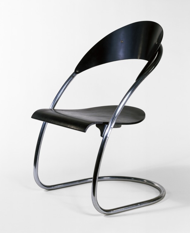
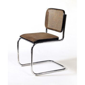
The work of Marcel Breuer, Mies Van der Rohe, Hans Luckhardt and Alvar Aalto stood out most to me.


Chair designed by Hans Luckhardt in 1929-1930
Source: http://media.vam.ac.uk/media/thira/collection_images/2006AU/2006AU9590.jpg


Chair designed by Marcel Breuer, 1928

I want to try and emulate this cantilever style when we have to chop up our chairs on monday. Obviously this wouldn't work on my wooden chair because wood cant take the same pressure as metal because it doesn't have as much tensile strength. But these designs by Alvar Aalto and Breuer gave me some ideas of how I could go about it.


Alvar Aalto Paimio armchair, 1930


Marcel Breuer, 'Short Chair', 1936
Source: http://www.vam.ac.uk/vastatic/microsites/1331_modernism/files/93/1935_london_breuer.jpg
I think this wooden versions of the cantilever chairs are just as successful as the metal ones. I like that there's a bit more softness to them- I can imagine them in a home more than the steel versions which look like they should be in a plush office or bar. The Breuer one is really satisfying to look at. It's fluid and all of its componant pieces slot together to give it a sense of harmony and completeness. I'm not expecting to be able to make something like this in a 3 day long project, but I do think there's alot of curved pieces to my chair which I could use as a basis to change it's overall structure.

Finally here are some of my sketches. (I'm aware I'm in need of a scanner)


Still don't understand why they rotate themselves.

Tuesday, 9 November 2010

Tokyo! film

Here is a link to a video for a film my friend Sali told me about called Tokyo. It's 3 short films and 1- called interior design- is about a girl who starts to feel invisible in her relationship and turns into a chair. I think it fits quite nicely with the animation I did.

I really want to see it.

Chair

Over our reading week we were given our first projects in our new areas. In 3D we were asked to find a piece of furniture which would evetually re-use, re-make and re-invent. Before we started breaking the furniture apart we had to become familiar with our piece be photographing it and sketching it.
Here are some of my photos.


I found the chair in brick lane and really liked the way it had loads of curved pieces to it. Also I thought it looked like quite a good bit of furniture to dismantle. It didnt feel too solid and there were lots of extra pieces that felt slightly seperate from the actual structure.

I was pleased with the photos, but I wanted to be a bit more experimental. I liked the idea of giving the chair a personality, making it into a character. To me it looked like it had its arms outstretched,like it was trying to hug somebody. So I developed this idea of a chair that had been rejected and had become useless. I thought of what a jobless chair would do with itself: have to take up extra work, for example as a footrest; hang a round in a waiting room or at a bus stop so people will sit on it; line up at a job centre. I then thought it would dream of being part of a home and of being accepted, I could picture it flicking through an ikea catalogue or gazing into the window of a furniture store.

Here is an animation I did to try and experiment with these ideas.


oh and and thanks to Sali and my ma fo helping me move around a chair in the rain. in public.

Monday, 1 November 2010

Drawing project

Here is a quick animation I did for this drawing award we have to do alongside the foundation course. I got inspiration from this animator Jeff Schers. Here is some of his work.
And here is mine.

Sunday, 31 October 2010

Blog Set Topic: Crossroads II

Throughout A level art I had a mix of both art and design elements in my work. I mainly worked in 3D with sculpture or installation and often made mini models of what my final outcome was going to be. By the end of year 13 my work had moved away from a fine art approach. However, until now I never fully exploited the design side of my working process.
I was really pleased when my first rotation was 3D and spatial design because I felt it covered the areas I wanted to explore for potential BA courses. In the summer I was on a course with the Architecture Foundation where we were working in the Lee Valley and having had a taste of designing and problem solving in the built environment, I wanted to find out more about architecture. I really enjoyed the first two weeks and felt they confirmed 3D/Spatial as my chosen area. I thought I was going to find the time scale a bit daunting, but generating ideas quickly and having a very ‘hands on’ approach really suited my way of working. In fact the speedy rotations helped my work and outcomes- in the last few days of 3D the shapes and forms I had been developing came together quite easily and the outcomes almost started to create themselves. It was also my first real experience of working from a set brief. It gave me a glimpse into the world of a designer and their task of creating for a client whilst still putting a personal stamp on their work.


A sketch by the architect Santiago Calatrava. I really like his approach to design. From looking at his buildings you can see his sources of inspiration are really varied, but his style stays consistently recogniseable- he takes alot from nature and the human body. For example the TGV station in Lyon, to me, resembles a spinal cord or the curved backbone of a fish skeleton.
Photo found at http://cmuarch2013.files.wordpress.com/2009/07/calatrava-com-1-32.jpg

I gained a lot from the other areas as well. I did a lot of animation in fine art, which I had never done before and in vis com I liked the freedom we were given to express ideas. I was really surprised by fashion and textiles because I though it would be the area I was going to take to least, but I thought it had lots in common with 3D. However, my ideas felt less direct and resolved than in 3D and I found it took longer for them to gain momentum- I think this is because of the context in which my ideas were taking shape, I couldn’t decide whether to concentrate on textiles and materials or fitting my pieces around the body.


These pieces are from 3D/Spatial (2nd pic) and fashion/textiles(1st). They show the similar process I took when I was generating ideas by cutting and folding paper.


I learnt a lot from all the rotations and they showed me how, whatever the project, you can cater it to your way of thinking and working. I used the areas to experiment with different techniques, but as I knew architecture was something I was interested in, all my pieces started (maybe subconsciously) to take on a structural or modular character.
Work outside of the studio also helped me decide that 3D and spatial was the right area. The suggestions provided by contextual studies of work we could research were helpful. Some of the exhibitions I visited I didn’t find that inspiring. 100% design at earls court was a real let down  as it showcased commercial, mainstream aspects of the design world- everything felt unaffordable and too polished and I couldn’t interact and involve myself in the ideas of the designers. But the Anti-Design festival was more interesting and Design 2010 at the design museum was great. I saw how design could be more about people and trying to “improve the little niggly everyday things” (said by Min-Kyu Choi who created the design of 2010, the folding plug). Recent lectures and seminars have helped me develop the way I think about art, design and the differences and similarities between them. I really liked the talk with Dominic Wilcox: his ideas were creative, experimental, funny and attempted to solve little problems I had never even thought about. I found it really inspiring to listen to somebody whose work refuses to settle into a specific category of art or design.  


Dominic Wilcox's work, Nimbus.
Picture from his website http://www.dominicwilcox.com/
 Overall, each rotation helped to convince me that a design route was right. I have learnt about generating ideas quickly, working to a brief, solving problems and interacting with different people and their ideas. I was worried that when picking a specialism I was going to have to sacrifice different processes I enjoy, but each area has emphasised how it’s important not to limit the way you approach projects. So in 3D I want to sketch, photograph, make models, experiment with texture, use all sorts of materials, but also introduce skills I’ve picked up on other rotations like film making and animation.

Wednesday, 27 October 2010

Vis Com Week 2

In our second week of vis com we started our third project: Audience. Over the weekend we had to come up with a few ideas of messages we could send to somebody or something. We could also send these messages on behalf of somebody/something else.

I started by thinking about more personal messages, things that I'd always wanted to say to specific people. For example, when I was younger my sister and I always tried to get my mum to quit smoking. So I thought about some original ways to send this message.


Here are some pages from my sketchbook. I looked at communicating through each component of a cigarette, eg. matches, lighter, rizla, filters. Then i looked at manipulating the health warnings on cigarette packets to display my message,  I swapped the pictures of lungs and black teeth for family photos,  then I thought about speaking on behalf of the cigarettes- ie. we have feelings too, stop burning our heads off.
I didnt really want to develop this idea though because I thought it had been looked at so many times before and I wanted to do something more original and maybe something a bit less sombre and a bit more silly.

I then looked at sending a message to my friend who looses everything to get her to hold on to her possesions a bit more.


This picture above was an idea I tried out when thinking of ways to make my friend more organised. It shows how she can prioritise the contents of her handbag. Number 1 (her purse) is something she should be extra careful not to loose, but number 8 (the tissues) wouldn't really matter.


My final idea came about when I was thinking about the different ways in which animals can communicate with one another. I thought of those small frogs that can be bright red or blue- these colours being a message to say 'Don't eat me' to predators. I thought this would be useful in the human world. Food could communicate with humans in order to dictate their diet. I used the traffic light colours- A burger could be bright red ("I'm bad for you, don't eat me"), cheese or meat could be orange ("Eat me if you want, but go easy") and fruit could be green ("Go ahead"). It sort of became a green cross code diet plan.


I then extended the idea to include objects. I like the way you could sawp colours around. For example tomatoes and strawberries could go from red to green. But I couldn't think of anything green which was unhealthy and could therefore become red. So I coloured in this dollar bill, playing with the idea that "money is the root of all evil".

I decided to carry on developing  the message to my friend who always looses things. On monday I covered the contents of my bag in gold foil. I was trying to show how everyday things are precious and shouldn't be taken for granted.


I like these outlines of the objects. It suggests absence and loss to me. It also reminds me of the outlines of bodies after a murder (bit dramatic sorry). Anyway these outlines I wanted to develop.


I can't go to the crit on Friday because I'm going to The Glasgow school of Art and ECA open days. Above is a short film I made to develop my "oulines of missing objects". I won't write much about it because I want people to interpret it themselves and generate their own ideas around it. (Plus the Vis Com tutors talk about how a piece of work should be able to communicate with its audience without a long explanation or discussion, so, enjoy.)