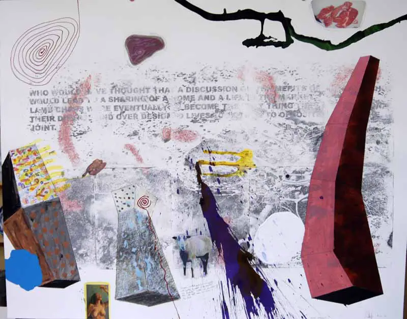
During the start of this week I have been developing some ideas I had over the weekend. As I said last time I was starting to feel a bit frustrated with the course that my FMP had taken and wanted to do something a bit different in my approach to the messaging space. When I was looking over some of my earlier sketchbook work I got back to thinking about maps and the piece I hap done layering together maps of Crouch from the 1870s and 1920s. I was amazed that in the space of 50 years a place could become totally unrecognisable. The only thing that matched in the maps was the hourglass shape of the broadway and the four roads that lead off from it.
Here is a page of my log book, showing a photocopy of my map piece. It made me wonder if the people living in crouch end would recognise a simplified map of the area when I confronted them with it. I felt this went along nicely with my revival- trying to get people back in touch with their area and connect with it more.
I took that map and started to experiment with ways I could use it in an installation.
I've been really lucky it's been so sunny, because this mud roc piece photgraphs much better in this light.
I'm going to carry on looking at these shapes and ways I can make them into compartments for dropping notes and letters. I have an idea of cutting them out of big sheets of MDF with a jigsaw and draping material behind it.
I'm off to interview Colin the magazine vendour on the broadway now
Here are some pics of how my scrim experiments turned out.
I really like the effect, but I still have this feeling like they're a bit too safe and sensible. Working with materials like this is something I'm used to and in this final project I want to challenge myself a bit more to stop my work becoming repetative and boring.
From these pieces I did some prints. I like printing, because you have to work quickly and loosely and I think this approach makes my ideas flow more easily.
I also wanted to try out my Blue plaque idae of doing a lino cut of a blank English Heritage plaque which could be filled in by any crouch end resident. I think the results convinced me to take a different route in my messaging space idea. They didnt find the prospect of exploring the blue plaques further that exciting and I wanted to switch course in my development. I alos remembered Gavin Turk and the way he had reinvented the plaque in a piece he did. I want Crouch Enders to see something new and different in town. Something that stirs their curiosity a bit more and something which they can more actively interact with. The plaques would only be able to celebrate a handful of residents, I want my installation to be something more open to the whole community.
I have this idea strirring about using this map I worked with at the beginning of the project. I layered together a map of crouch from the 1860s with one from the 1920s and then made my own map of present day over them. I traced some of the main streets and the ones that are most meaningful to my day to day life. I like the traces of the broadway and the spread of roads leading off from it.
I can picture the traces becoming cut outs that could look like a wall of holes- it would look organic and natural while also having the regular pattern of the area.
For the next couple of days I'm going to explore this map idea. Also on Wednesday, I've arranged to meet colin (the magazine vendour in crouch) for a cup of tea to talk about his selling booth. He told me its been in his family for 3 generations so i can't wait to here more about his relationship with the area.
Over the past couple of days I've been experimenting with texture and colour. I've really enjoyed it and its made me feel like like I'm getting more into the swing of things. Ideas are coming a bit more easily now. Here are some pieces I did as experiments in my sketchbook.
Will Alsop's work, which I saw some of over the weekend really inspired me to be more bold in my use of colour.
This second piece gave me some ideas for the development of my messaging centre. I liked using the scrim and felt it was something that i could easily manipulate. Yesterday evening I did some experiments, dipping the scrim in a mix of Pva and water, creating these gaping holes in it and leaving it to dry in different shapes. Here are some designs I developed from there.
I like these initial sketches, but I feel that they are prehaps a bit too safe. In an assessment I once had with Camilla, she once talked about the way I have a tendency to go down a route which is quite safe, and will always lead to something quite conventionally pleasing to the eye. With this project I want to do something that feels like my style, but also something which is a bit different and perhaps a bit riskier. This idea is quite similar to my Ernesto Neto inspired xmas project.
I'm still thinking about the blue plaques and different ways I can reinvent that style of messaging. However, working with the plaques perhaps limits my freedom when developing the space's overall form. the shape would have to be simpler, so the plaques stand out as a main focus.
The internet is being a bit weird and keeps on shutting down, so I won't write too much more.
For the rest of today I'm going to go and visit this other space at the Royal academy which has some more pieces by Alsop. I'm also visiting the Haunch of Venison with a friend from Camberwell.
For the next few days I'll carry on looking at texture, weaving and fabrics, but I'll also look at printing some templates for blue (or maybe, red, orange, green etc) plaques
Today I was sorting out some research and emailing the Haringey Council to get permission to put up my temporary message hub. The research is going quite well, but I still don't feel that everything is clicking together properly or that ideas are growing organically. I feel at the moment as though I'm trying to control and order notes, images and articles instead of the work developing on its own accord. I need to carry out my 'temporary messaging space' idea first because I think it will be a really fun and different part of the revival project.
I wrote to the council so I can get a license to put up my installation, but I'm a bit worried they'll grill me for all sorts of health and safety things.
In the meantime I'm going to try and develop some material samples for the installation itself. I'm going to do some weaving (inspired by Alsop's piece I saw yesterday). I'm also going to try experimenting with fabrics like different types of netting.
Rupert had a look through my work this morning and we discussed the way's in which I will encourage people to leave messages and become involved with the piece. I would quite like to build on the blue plaque research I was doing last week. I could do a string of prints for blue plaque templates and get people to fill them in. It would tell me about the type of people that live in crouch end today, while also making it seem as though the residents will be remembered in the area's history. The plaques could be hung all over the installation.
On Sunday I went to the London Street Photography exhibition at the Museum of London. In my research I have looked at some old postcards of Crouch End in the early 20th century and I was fascinated by the clear sense of community which was bought to the are through trading and markets. I wanted to look further into London life at the turn of the century and the ways communities were shaped by various cultural factors.
Overall, the exhibit was interesting, but didn't help me greatly in widening my ideas. My favourite photos were a collection recording life for the West African community in Notting Hill during the 50s and 60s. At a time of social tension, the photographer wanted to capture the strong bonds between black and white people.
Also as I was in the area, I went to Postman's Park to visit the monument to the 'heroic self sacrificers' which Susan Hiller used in her piece 'Monument'.
It was helpful to record another example of messages and the spaces which are created to display them.
I then went to Masterworks: Architecture at the Royal Academy. It was great. I really enjoyed the work of Alan Stanton and Will Alsop- 2 architects I haven't really come across before. Alsop's piece 'Fog is an Urban Experience' was inspiring- It was refreshing to see architects approaching projects in a more rough and creative way. I want to use some paint, collage and colour in my revival project- its a good way to build up a realistic picture of the part urban, part suburban character of Crouch End
Today we were meant to stay in college all day for a crit. Not many people were in though, because of interviews and portfolio preparation, so the crit was finished by about 12. I found it really helpful though. when I showed my research so far to my group Alex told me it reminded her of something she had seen recently in the saatchi gallery- the piece was 'The followers' by Ximena Garrido- Lecca.
The Followers by Ximena Garrido- Lecca. I liked the work but wasn't sure if it fitted in with the surrounding works. Saatchi usually seeks to include stand out works that are shocking or completely new. The piece didn't really feel completely convincing as a piece of bold installation or sculpture.
I had pictures of Pere Lachaise cemetary in Paris- I went in the summer and had taken loads of photos of this semi underground memorial. The walls of the space were basically grids where people's ashes were placed and then covered with plaques.
In the afternoon I went along to the saatchi gallery to do some sketching. I normally go to the new Saatchi exhibitions but mostly I find them quite disappointing. The first part of the Newspeak exhibitions last year I really didn't enjoy, but I actually quite liked this recent Newspeak one. The sculptures and installations got me thinking about just how wacky my message space could be- especially if I want it to be something eye catching and fun for residents. For example, I really like how Graham Hudson's piece was alot like a performance in itself. It was chaotic, noisy and had to be re-erected in a different way with each new exhibition.
Graham Hudson 'All My Exes Live in Tesco's'
Dean Hughes 'Shelves (iv)'
Juliana Cerqueira Leite 'Oh'
All these pieces above really helped me to widen my ideas of how to design a messaging space. They're all very different but they make me feel confident that I can come up with something bold and experimental. Like Hudson's piece I want to experiment using found objects aswell.
Aswell as developing this 'message space' idea I've also had another idea which I'd like to look at closer. In Crouch End there is this magazine vendour Colin who sits in this small green shed on the Broadway facing the clocktower. He's been there for ages and is somebody all the locals know quite well. I'd like to design him a new space to sell his papers from. I want to reinvent a space which is somewhat overlooked- everybody is aware who Colin is, but they dont really notice much when it comes to his green shed. He's based in such a prime spot on the broadway, a new 'shed' would be instantly noticeable.
I went to see Susan Hiller's new exhibition on thursday. I'd never come across her work before, but I really enjoyed some of her stuff. I had read about her work 'monument' in the tate magazine before I went. The piece caught my eye instantly because I have often visited the wall of self sacrificers on which it is based- the wall of plaques is in Postman's Park, not far from the Museum of London. I liked the way Hiller had included the bench and the audio in the piece, it made it more of an installation and something the viewer could fully involve themselves in.
Monument 1980-81
The other piece which immediately comes to mind is 'Witness', where hundreds of speakers hang in a dark room flooded with an eiree blue light. Each of the speakers is playing out somebody's recount of an extra terrestrial experience. It is impossible to discern an individual voice without holding your ear up to one single speaker, and even then you find yourself being distracted by a voice a few speakers on. I know you cant see the piece very well in this video, but you can definately hear whats going on.
Apart from these two quite obvious and memorable audio installations, I found Hiller's presentation of her other 2D work interesting aswell. I liked the L shaped frames she has used and the way she hung shredded canvases or bound them into small parcels.
One of the pieces I found quite frustrating was 'From the Freud Museum'. I just couldn't properly connect with it. I didn't really understand what Hiller was trying to communicate and I didn't find the small compact boxes she displayed the objects in that interesting- especially when put next to the sprawling threads from her canvases or her bold prjected films.
I found the exhibition really useful in developing my ideas. Especially 'Monument' which directly links with my explorations into plaques and the spaces used to display them. I still want to start working in a more bold and experimental way with materials. When I look more closely at constructing my temporary message space for crouch end, I want to use netting or woven fabrics that can be easily manipulated.
These are plaques that were lined up on the hand rails on Southwold Pier. I visited Southwold last weekend and I loved the way these personal messages added a bit of personal interest to the pier.
For my FMP I've decided to focus on my area and ways to bring more energy and excitement into it. Crouch End, in north London, is different from alot of surrounding areas- its always refered to as having a 'villagey feel' because its quite tucked away and surrounded by hills. Recently, lots of shops along the broadway have closed down and those that aren't replaced by bigger chain stores are just left as empty shop fronts. I've heard quite alot of people saying how Crouch End has gone 'down hill' so I want to stage several small interventions (some temporary and I'll make plans for other permanent proposals) which will become talking points among the residents.
We started our projects on Monday and from now on I'm going to record my experiments and experiences for this 6 week project.
these first 3 pics show a stretch of the broadway which always seems hardest hit by the recession. It has the most bare shopfronts.
This is the crouch end clocktower which is the focal point to the area (still cant stop this pics rotating themselves).
At first I thought i would just focus on the clocktower and ways in which I could draw interest to the monument and the island it stands on. At the moment the tower is practically a traffic bollard, sitting at a busy junction of two very busy roads. I still definately want to look at the tower, but i also want to work on other sites in and around the main broadway.
For these first few days I've been researching the area, drawing little details, sketching buildings and looking into the history of hornsey and crouch end. 've found it quite weird researching and studying a place i've lived in all my life- its almost more of a challenge than approaching a site and researching it for the first time. Today I walked around and did some sketches in the centre of crouch. I focused on the contours, lines and silhouettes of the surrounding buildings. It was really useful, because i began to notice lots of small details that i wouldnt usually pick out.
I've also been doing a string of research on plaques- this stemmed from when English Heritage sewed this small art gallery in the area a couple of years ago for putting a blue plaque on the clocktower reading " The man that sleeps with your wife lives here".
I remember it being something all crouch end residents were aware of and it became quite a talking point. I like that idea of crouch enders being bought together by little messages and funny occurances. It would be great to construct this temporary space in the centre of crouch end where people could slip little messages and communicate with each other - it would be a bit like a physical social networking space.
I've got a few other ideas of ways to extend my revival project- one being replacing the clocktower with another time keeping device, maybe an hourglass. But I'm finding the idea of getting a 6 week project on the way quite daunting. I've got used to 1 or 2 week long projects and at the moment I feel like I'm hovering on the periphery of my ideas, when i just want to go for it and get on with them. Tomorrow I'm going to do a bit more research into drop boxes and ways of sending messages.
Here's a video of one of my favourite scenes. I'm sure this isn't a very original choice, its one of the most memorable of Slacker's funny moments.
Before watching ‘Slacker’ I had only ever heard of Richard Linklater from his films ‘Before Sunrise’ and ‘Before Sunset’. I watched Before Sunset with my mum about 5 or 6 years ago and both of us were completely non-plused. Firstly, we didn’t know it was a sequel, which didn’t help, but I also remember thinking it was crazily short (its 80 minutes long, but it felt like the credits were rolling after only 30). I thought the film hadn’t gone anywhere. It felt rambling and structure less.
Luckily I’ve got a lot more adventurous in my film choices since the age of 13 and instead of feeling frustrated and confused at indy films, I enjoy them- a lot of the time more than the big budget Hollywood ones. So, when I saw ‘Slacker’- which is a film which epitomises ‘rambling and stuctureless’- I got really into it and for a while after the screening, I couldn’t get it out of my head, I couldn’t believe how clever it all was.
Everybody who reviews this film is faced with the seemingly impossible task of having to summarise it. It is ultimately a day in the life of the residents of Austin, Texas. Linklater collages together scenes made up of countless numbers of characters (the full list is here. I wouldn’t even attempt to recount a quarter of the credits). Some are obscure, some eccentric, some lazy, but none are named and all of them feel extremely real. This collage that is created mostly feels completely ramshackle and chaotic, while at the same time the long takes and seamless transitions leave the audience convinced of the film’s meticulous planning and careful execution. At times the camera will roll for over 10 minutes to create one, long, uninterrupted stream of consciousness- perhaps focusing on a pestering stoner preaching about how ‘we’ve been on Mars since 1962’, or on a girl trying to flog ‘Madonna’s pap smear’.
Most reviews I’ve read of ‘Slacker’ focus on the $23,000 dollar budget, which gets a bit boring, but it can’t be denied that this low funding shapes many aspects of the film. For instance, the fact that most of the ‘actors’ weren’t professionals heightens they’re believability. Linklater himself talks of how the budget limitations meant scenes had to ‘have nothing going on… instead of anything going on’. He also refers to ‘Slacker’ as a ‘summer art project’- I feel this sums up the film perfectly. It’s risky and experimental, but it doesn’t seem to try too hard.
Yet I understand why some critics got frustrated after about an hour of ambling along with only drop outs and average joe’s for company. Vincent Canby ( reviewer for the New York Times) explains how he felt ‘a monotony set in, as well as desperation’.I definitely found some of the philosophical rants undertaken by the characters hard to keep up with. By giving the ‘limbo dwellers’ of society so much space to air their views and theories, Linklater sometimes leaves his audience at the mercy of ramblers that would win prizes in their efforts to bamboozle they’re victims on topics we actually don’t know or care about. Sometimes I felt like I should listen because to ignore somebody preaching about society’s countless flaws would make me cultureless or ignorant
However, one reason I liked the film so much overall was the way it reminded me of my favourite book- Irvine Welsh’s ‘ Trainspotting’. On the surface this might seem a weird comparison, as, admittedly the drug fuelled aggressive lifestyles of young Scottish outsiders isn’t exactly similar to the carefree eccentrics of Austin. But, the way Welsh strings together juxtaposed, incomplete and fragmented images of characters and their situations relates a lot to what Linklater is trying to achieve in Slacker. Trainspotting’s chaotic narrative is made up of 43 sections which constantly shift between separate and often unidentifiable viewpoints- Welsh describes it as ‘a bunch of voices shouting to be heard’. Both have the sense of wanting to paint a portrait of an underlying subculture- whether it’s of the ‘marginal, eccentric and over educated citizens in Austin’ or the hopeless druggies living in the Leith docklands in the 80s. Thinking about the way Welsh represents the unrepresented in his book, I saw how Linklater strove to show a bunch of people scrambling around in the early 90s searching for their generation’s identity.